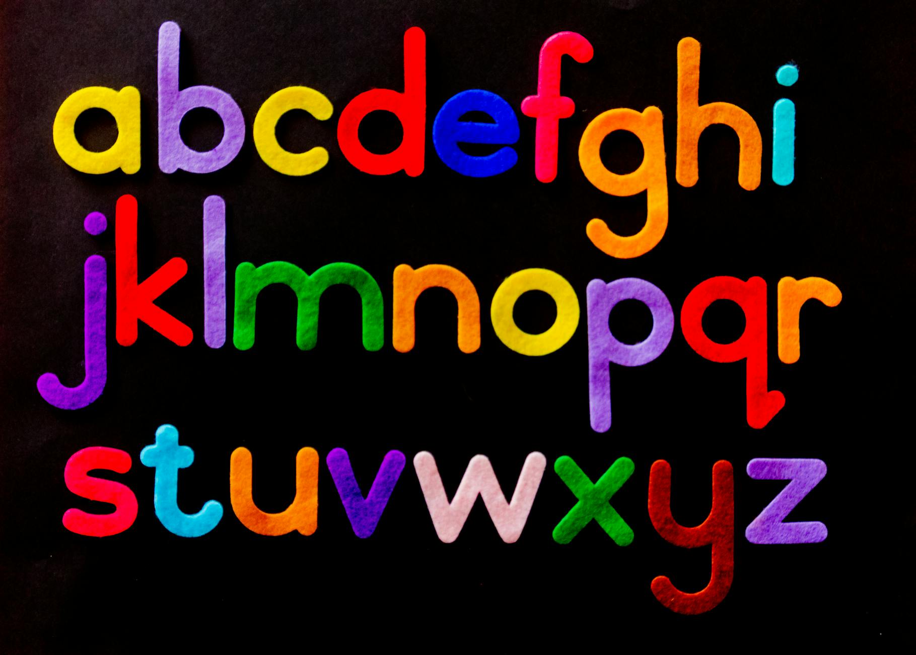
Practical Guide to Japanese Typography and Readability Accessibility: Font Size, Line Spacing, Paragraph Design, Ruby, Vertical Writing, Dark Mode, and Variable Fonts
Summary (Key Points First)
- For readable Japanese UI/articles, get these six basics right: font size, line spacing, line length, paragraph spacing, contrast, and color scheme—that’s 80% of the outcome.
- Use redundant cues beyond color for emphasis, ensure contrast ratios of 4.5:1 (regular text) / 3:1 (large text), and add underlines on links to convey meaning with redundancy.
- For responsive typography, combine
clamp()with@mediato support 1.4.4 Resize Text (200%) and 1.4.10 Reflow (avoid forcing horizontal scrolling).- Design ruby, proper nouns, loanwords, numbers & units with screen readers, search, and machine translation in mind; expose meaning with the
langattribute and proper ruby markup (ruby/rt/rp).- Respect
prefers-color-schemeandprefers-contrastfor dark mode and high-contrast themes. Don’t forget focus visibility (:focus-visible) and 3:1 for non-text UI.- Vertical writing / editorial layouts often sacrifice legibility for “vibes.” Achieve readable vertical text with balanced line spacing, line-breaking rules, font size, and line grid.
- With variable fonts, adapt weight and width to the UI, mitigate FOUT/FOIT, and prioritize body text in font loading.
Intended readers (concrete roles): Editors & content designers, UI/UX designers, front-end engineers, technical writers, PR/HR/education content teams, municipal/public-sector web managers
Accessibility target: WCAG 2.1 AA (and, where feasible, 2.2 items like target size, drag alternatives, and enhanced focus appearance)
Beneficiaries (examples): People with low vision/cataracts/accommodation decline, color-vision diversity, screen-reader users, diverse auditory/cognitive needs, mobile users, readers in bright outdoor or dark environments
1. Introduction: Typography is the “blueprint of readability”
When we say web accessibility, people think first of contrast and alt text. But Japanese readability is decided by steady, basic typography.
If font size, line spacing, line length, paragraph spacing, and heading hierarchy are tuned, both screen readers and sighted readers can “move forward without getting lost.” Conversely, tight line spacing, run-on paragraphs, low-contrast gray text, and links indicated only by color invite fatigue and misunderstandings, especially with zoom and speech.
This guide covers Japanese-specific mixed scripts (kana/kanji/loanwords/numbers) and extends through ruby, vertical writing, and dark mode, offering implementation patterns you can apply immediately.
2. The Six Basics: Font Size, Line Spacing, Line Length, Paragraph Spacing, Contrast, Emphasis
2.1 Font size (body & headings)
- Body: start at 16–18px (respect user default zoom). For news/long reads, 18px is safe.
- Headings:
h2at 1.35–1.6× body,h3at 1.15–1.3×. Use spacing around headings to express hierarchy—don’t overdo size jumps. - Fluid type: auto-scale with
clamp().
:root{
  --step-0: clamp(1rem, 0.9rem + 0.5vw, 1.125rem); /* Body */
  --step-1: clamp(1.35rem, 1.1rem + 1vw, 1.6rem);  /* H2 */
  --step-2: clamp(1.15rem, 1rem + .6vw, 1.3rem);   /* H3 */
}
body{ font-size: var(--step-0); }
h2{ font-size: var(--step-1); }
h3{ font-size: var(--step-2); }
2.2 Line spacing (line-height)
- For Japanese, aim for 1.6–1.8. Use slightly wider for kanji-heavy texts/long reads to reduce fatigue.
- Headings/footnotes can be tighter (1.3–1.5). Check you don’t collide punctuation at line ends.
2.3 Line length (characters per line)
- 40–80 full-width characters per line is a good range (20–35 for two-column layouts).
- On mobile, target ~33–45 full-width characters. Keep side padding to preserve a column feel.
2.4 Paragraph spacing & heading spacing
- Between paragraphs: 0.5–1 line. Before
h2: 1.5 lines, after: 1 line (as a starting point). - Avoid first-line indents on the web; use vertical spacing to mark paragraphs—more universal.
2.5 Contrast (WCAG 1.4.3 / 1.4.11)
- Regular text 4.5:1, large text 3:1, non-text (icons/borders) 3:1.
- On images/video backgrounds, add a semi-transparent plate to protect text.
2.6 Redundant emphasis
- Don’t rely on color alone. Combine weight/underline/icon/note.
- Links: color + underline (and thicker underline/background on hover) to support color diversity and print.
3. Responsive type & zoom: stable even at 200%
3.1 Resize Text (1.4.4) & Reflow (1.4.10)
- At 200%, avoid forced horizontal scrolling (except big tables/diagrams).
- Prefer relative units (
rem/em) andclamp()—don’t over-rely on fixed px.
html{ font-size: 100%; } /* Respect user settings */
main{ max-width: 72ch; margin-inline: auto; padding-inline: 1rem; } /* Optimal line length */
3.2 Line breaks and kinsoku (Japanese line-breaking rules)
- Japanese has weak word boundaries; keep
word-break: normal;and rely on browser kinsoku by default. - For long alphanumerics, use
overflow-wrap: anywhere;to prevent layout breaks. If readability suffers, consider soft hyphens­manually.
p{ word-break: normal; overflow-wrap: anywhere; }
code, pre{ overflow-x: auto; } /* Keep code scrollable horizontally */
3.3 Text spacing (consideration for 1.4.12)
- In Japanese, letter-spacing is less intuitive than in Latin scripts.
- Create “air” with paragraph spacing, line spacing, and margins. Use generous line-height & padding for buttons/forms to reduce tap errors.
4. Ruby, screen readers, proper nouns: markup that conveys meaning
4.1 Ruby (furigana)
- Use
ruby/rt/rpand provide parentheses fallback for non-supporting environments.
<ruby>可読性<rp>(</rp><rt>かどくせい</rt><rp>)</rp></ruby>
- Long ruby can interrupt flow. Limit to keywords/names/places; prefer rewording or footnotes in body copy.
4.2 Screen reading and lang
- For loanwords/proper nouns, switch
langper span to improve pronunciation.
<p>This product supports <span lang="en">Single Sign-On</span>.</p>
4.3 Numbers, units, full-/half-width
- Use half-width for numbers + units (e.g., 100 MB, 24 h). In Japanese text, keep spaces around units clear.
- For dates, add an unambiguous international format like YYYY-MM-DD to reduce misreads.
4.4 Rewording for clarity
- “Default” → “initial setting,” “assign” → “allocate,” etc. Provide a Japanese definition at first mention of jargon, then short forms thereafter.
5. Color, palettes, dark mode: inclusive in low/high light and for diverse vision
5.1 Luminance and mid-tones
- On dark backgrounds, avoid pure white text (#FFF is glaring). Prefer #EEE–#F2F2F2 and slightly widen line-height to reduce eye strain.
5.2 prefers-color-scheme and prefers-contrast
@media (prefers-color-scheme: dark){
  :root{
    --bg: #0f1115; --fg: #e9ecf1; --muted:#a9b3c1; --card:#171a20;
  }
  body{ background:var(--bg); color:var(--fg); }
  .card{ background:var(--card); }
}
@media (prefers-contrast: more){
  :root{ --fg:#ffffff; --link:#58a6ff; }
  a{ text-decoration-thickness: .14em; }
  button:focus-visible{ outline: 3px solid #ff9900; }
}
- Enhance not only colors but also underline/border thickness and focus rings.
- Remember 3:1 for non-text (icons, borders, focus indicators).
6. Vertical writing & editorial flair: balance aesthetics with legibility
6.1 Basics of vertical writing
- Use
writing-mode: vertical-rl;, set line-height ~1.8, and 20–35 chars per line (vertical). - Non-rotating characters and punctuation handling vary by browser—verify visually.
.vertical{
  writing-mode: vertical-rl;
  line-height: 1.8;
  max-height: 35em; /* Line length control (vertical) */
}
6.2 Banner headings & tate-chu-yoko (upright numerals)
- Use
text-combine-upright: all;sparingly—overuse disrupts rhythm. - For banner headings, ensure adequate contrast and guide reading order with whitespace.
7. Heading hierarchy, ToC, landmarks: tidy up the “map”
- One
h1per page. Chaptersh2, sectionsh3. Base on semantics, not size; style via CSS. - A key-points list at the top (like this document) reduces cognitive load.
- Provide an in-page ToC and skip links for shortest-path navigation.
- Landmarks (
header/nav/main/aside/footer) become the map for screen readers.
Even perfect typography can fail without a map. You need structure and presentation.
8. Variable fonts & font loading: faster, smoother, more readable
8.1 Variable fonts
- Dynamically optimize weight (
wght) and width (wdth). On small screens, narrow width slightly for cleaner line length. - Change weight incrementally on hover/focus to emphasize without color reliance.
@font-face{
  font-family: "NotoSansJPVar";
  src: url("NotoSansJP[wght].woff2") format("woff2-variations");
  font-display: swap;
}
body{ font-family: "NotoSansJPVar", system-ui, -apple-system, "Yu Gothic", sans-serif; }
strong{ font-variation-settings: "wght" 700; }
8.2 FOUT/FOIT mitigation & readability
font-display: swap;to prioritize body text rendering.- Apply special display faces lazily (watch CLS).
- Avoid synthetic bold: ship a true ~700 axis.
9. Implementation recipes by UI component
9.1 Buttons
- Text 4.5:1, non-text 3:1.
min-height: 44px, horizontal padding 12–16px. - Labels should be verbs: “Submit,” “Save,” “Delete.”
button{
  font: inherit; line-height: 1.2;
  padding: .65em 1em; border-radius: .5rem;
}
button:focus-visible{ outline: 3px solid #ff9900; outline-offset: 2px; }
9.2 Forms
- Visible labels required; examples via
aria-describedby. - Errors must use color + text + icon, with concise What/Where/How fixes.
- Generous line-height and padding reduce tap errors.
9.3 Lists & bullets
- One idea per sentence; keep 1–2 sentences per item.
- Standardize list-item starts (all nouns or all imperatives) to stabilize reading rhythm.
9.4 Tables & charts (highlights)
- Use
captionand state units. Slightly wider row height; 8–12px vertical cell padding. - For charts, communicate via color + line/shape redundantly, and summarize insights in text.
10. Readable Japanese prose practices
- Short sentences: cap at ~60 characters; don’t chain endlessly with conjunctions.
- Keep subject–predicate close; place modifiers briefly up front.
- Use conclusion → reasons (avoid inversion).
- For katakana loanwords, explain once, then use short forms.
- Translate charts into sentences so screen-reading doesn’t need the graphic.
- Unify terminology (choose “メール” or “Eメール,” not both).
11. Fine-tuning dark mode: text, line spacing, elevation
- In low light, perceived contrast changes; add +0.1–0.2 line-height and shift text toward soft grays.
- Go easy on drop-shadows; separate with borders (3:1) instead.
- Prefer non-motion emphasis (subtle background plates) to guide attention.
12. Five-minute smoke tests: the minimal ritual for readability
- At 200% zoom, ensure no horizontal scroll (except tables/code).
- Grayscale the page—are emphasis, links, and buttons still clear?
- In dark mode, are contrast and line spacing still adequate?
- With a screen reader, is Headings → Body → Links a natural order?
- At 320px width, check line length, paragraph spacing, and tappability.
- For vertical pages, check punctuation, tate-chu-yoko, and banner headings.
- Alphanumerics/proper nouns—do
langspans read correctly?
13. Case study: three typography fixes → time-on-page +22%
Before
- Body 14px / line-height 1.4; color #666; links blue only, no underline.
- Large gaps between heading sizes; uneven paragraph spacing.
- On small screens, line length >60 chars → readers get lost on wraps.
After
- Body 16→18px, line-height 1.4→1.7; body #222; links underline + thick hover underline.
- Unified heading hierarchy and paragraph spacing (before 1.5 lines / after 1 line; paragraphs 0.75 line).
- Introduced fluid type with
clamp()andmax-width: 72chfor line length.
Result: Avg. time-on-page +22%, bounce rate −11%, readability complaints from zoomed users −86%.
14. Common pitfalls & how to avoid them
| Pitfall | What happens | Fix |
|---|---|---|
| Body 14px; line-height 1.2 | Fatigue; exits | Base on 16–18px / 1.6–1.8 |
| Links rely on color only | Missed/ambiguous links | Color + underline; stronger hover |
| Dark mode with pure #FFF text & same spacing | Glare; cramped | Use softer white and +0.1–0.2 line-height |
| Full-width digits; inconsistent terms | Hard to read; weaker search | Half-width digits; define a style guide |
| Long katakana terms repeatedly | Skipping | Explain once, then shorten |
px-fixed headers/buttons |
Breaks at 200% | Use rem/em/clamp() |
| Ruby baked into images | Unreadable for SR | Mark up with ruby/rt/rp |
| No variable fonts | Clunky weight/width | Variable fonts + swap |
| Kinsoku broken in vertical layout | Misreading | Visual QA, minimal tate-chu-yoko |
15. Paste-ready starter CSS for readability
/* 1) Base scale */
:root{
  --bg:#ffffff; --fg:#222222; --muted:#555; --link:#0B63F6;
  --border:#C9D1D9; --focus:#FF9900;
  --content-width: 72ch;
  --step-0: clamp(1rem, 0.9rem + 0.5vw, 1.125rem);
  --h2: clamp(1.35rem, 1.1rem + 1vw, 1.6rem);
  --h3: clamp(1.15rem, 1rem + .6vw, 1.3rem);
}
@media (prefers-color-scheme: dark){
  :root{ --bg:#0f1115; --fg:#e9ecf1; --muted:#a9b3c1; --border:#273142; --link:#58a6ff; }
}

/* 2) Body & paragraphs */
html{ font-size:100%; }
body{
  margin:0; background:var(--bg); color:var(--fg);
  font-family: system-ui, -apple-system, "Noto Sans JP", "Yu Gothic", sans-serif;
  line-height:1.7; text-underline-offset:.2em; text-decoration-thickness:.08em;
}
main{ max-width:var(--content-width); margin-inline:auto; padding: min(4vw,2rem); }
p{ margin-block: .75em 0; }
p + p{ margin-top: .75em; }

/* 3) Headings */
h1,h2,h3{ line-height:1.35; margin: 1.5em 0 .8em; }
h2{ font-size:var(--h2); }
h3{ font-size:var(--h3); }

/* 4) Links & focus */
a{ color:var(--link); text-decoration: underline; }
a:hover{ text-decoration-thickness:.14em; }
:focus-visible{ outline:3px solid var(--focus); outline-offset:3px; }

/* 5) List & table spacing */
ul,ol{ padding-left:1.2em; margin-block:.8em; }
table{ width:100%; border-collapse:collapse; margin-block:1em; }
th,td{ padding:.6em .5em; border:1px solid var(--border); }
caption{ text-align:left; color:var(--muted); margin-bottom:.25em; }

/* 6) Text over images */
.overlay{ position:relative; }
.overlay::before{
  content:""; position:absolute; inset:0; background: rgba(0,0,0,.35);
}

/* 7) Vertical writing utility */
.vertical{ writing-mode: vertical-rl; line-height:1.8; }

/* 8) Ruby visibility */
ruby{ ruby-position: over; }
rt{ font-size:.75em; color:var(--muted); }
16. Operationalizing typography in your design system
- Type scale: Tokenize sizes/line-heights/margins for body/headings/notes/code.
- Color tokens: Variables for background/body/link/border/focus, with both light/dark themes.
- Style guide: Conventions for ruby, proper nouns, numbers/units, and full-/half-width usage.
- Font ops: Variable font axes (wght/wdth),
font-display, and language fallbacks order. - Verification: Add a 5-minute smoke test to PRs: 200% zoom, dark/high-contrast, SR heading list, 320px width.
17. Benefits by role
- Editors/content designers: Standard patterns for line spacing/line length/paragraphs → reproducible readability.
- UI/UX designers: Guidance on color, underlines, focus → less reliance on color-only emphasis.
- Front-end engineers:
clamp()/tokens/variable fonts → stable multi-device styling. - Public/education: Navigable long-form layouts → better accountability and learning outcomes.
- Users (low vision, color diversity, SR): Less fatigue; shared understanding.
18. Conclusion: Readability is kindness
- Base on 16–18px body, 1.6–1.8 line-height, 40–80 chars per line, then tune paragraph spacing and heading hierarchy.
- Ensure 4.5:1 / 3:1 contrast and color-independent emphasis (underline, bold, borders) so everyone reaches the same understanding.
- Use
clamp()+ relative units andmax-width: 72chto survive 200% zoom and reflow. - With
ruby/langand clear number/unit rules, make text robust for screen reading, translation, and search. - Respect user prefs for dark/high-contrast; keep focus rings and 3:1 non-text.
- Variable fonts + swap yield faster, smoother, more legible text.
- Sustain quality with 5-minute smoke tests and design-system tokens.